|
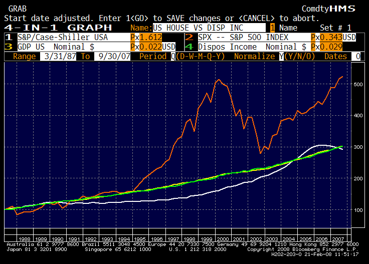
The first chart looks at the S&P/Case Shiller USA compared with US GDP, US Disposable Income and the S&P 500 Index since 1988 (when the Shiller Index was first available).
Since the early 1990s, US real estate grew below the pace of GDP and Nominal Income and has begun to accelerate in the late 1990s before overshooting over the past five years. So by looking at the market as a whole it is difficult to argue that there was a real "bubble", even though some regions and/or cities (South Florida, Manhattan) have experienced exagaerated moves. US real estate price appreciation is also well below many European countries such as the UK, the Netherlands, France or Spain.
The recent correction can be seen as a healthy "return to the mean", but it is hard to argue about a "bubble-burst".
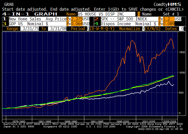
The first chart looks at New Home Sales in the US compared with US GDP, US Disposable Income and the S&P 500 Index since the mid 1970s.
www.amecofs.com
|

